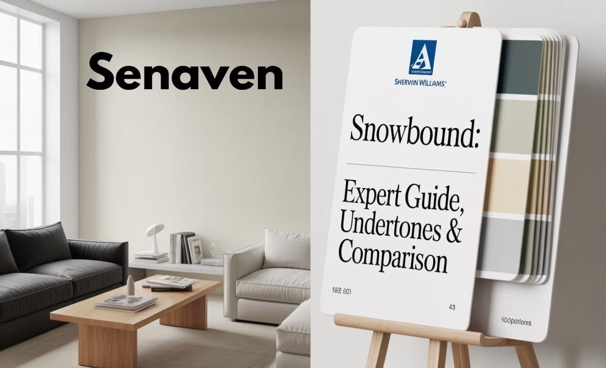
Snowbound Sherwin Williams: Expert Guide, Undertones & Comparison
Choosing a white paint sounds simple until you actually see it on your walls. Most homeowners searching for snowbound sherwin williams are usually stuck between multiple whites that all look similar on a sample card but behave completely differently in real lighting.
Sherwin-Williams Snowbound (SW 7004) has remained one of the most searched and widely used soft whites because it sits in a very specific design zone—it is not too warm, not too cool, and not too stark. Instead, it adapts depending on lighting, finishes, and surrounding materials.
In modern homes (2024–2026 design trends), Snowbound is especially popular because interiors now mix warm woods, black accents, marble textures, and LED lighting. This makes a “balanced white” more useful than a pure bright white.
This guide explains everything you actually need before choosing it: undertones, LRV, interior and exterior use, cabinets, comparisons with Alabaster and Pure White, and real-world performance.
What Is Snowbound Sherwin-Williams Paint?
Snowbound (SW 7004) is a soft neutral white designed for versatility. It is part of Sherwin-Williams’ most widely used white family and is often selected for full-home applications because it doesn’t feel overly stark or overly creamy.
With an LRV of 83, Snowbound reflects a high amount of light, but still maintains softness. This is why it looks brighter in open sunlight and slightly muted in low-light rooms.
Unlike pure bright whites used in ultra-modern spaces, Snowbound has a controlled softness that makes it feel more natural in real homes rather than showroom environments.
Snowbound Sherwin-Williams Undertones (Most Important Factor)
When people search snowbound sherwin williams undertones, they are usually confused after seeing it behave differently in different rooms.
Snowbound is not a flat white. It has layered undertones:
In most environments, it shows a soft gray base with a subtle beige warmth underneath. This combination is what gives it a “soft neutral” identity instead of a cold or creamy look.
In north-facing rooms, Snowbound leans more gray and muted because of cooler natural light. In south-facing rooms, it warms slightly and feels more balanced. Under modern LED lighting, especially cool white bulbs, it can appear slightly cooler and more gray than expected.
One of the most important real-world factors is surrounding finishes. Snowbound reacts strongly to floors, cabinets, and countertops. Warm wood tones make it look more balanced, while cool gray materials can push it slightly warmer in contrast.
Snowbound Sherwin-Williams LRV Explained
The LRV (Light Reflectance Value) of Snowbound is 83, which places it in the soft white category rather than bright white.
This means it reflects most light but still absorbs enough to avoid a harsh or clinical look.
In real homes, this LRV makes Snowbound:
- Bright enough for open spaces
- Soft enough for bedrooms and living rooms
- Flexible for both modern and transitional designs
However, LRV alone does not guarantee appearance—lighting temperature and surface finishes always influence the final look more than the number itself.
Snowbound Sherwin-Williams Interior Use
When used indoors, Snowbound is most effective in homes that want a soft, cohesive look across multiple rooms.
It works especially well in open-concept layouts where walls, hallways, and living spaces need to feel connected without visual breaks.
In interiors, Snowbound performs best when paired with natural materials like wood, stone, and brushed metals. It also works well in homes that avoid overly stark contrast and instead prefer a layered neutral palette.
On walls, it creates a calm background without feeling dull. On ceilings, it adds subtle warmth compared to pure bright whites.
Snowbound Sherwin-Williams Cabinets (Highly Popular Use Case)
One of the biggest search intents is snowbound sherwin williams cabinets, and for good reason—this is one of its strongest applications.
Snowbound is widely used for kitchen and bathroom cabinetry because it offers a soft white look that avoids the sterile effect of ultra-bright whites.
It pairs especially well with:
- Brass or gold hardware
- Matte black fixtures
- Quartz countertops with soft veining
- Natural wood islands or accents
Finish matters significantly here. Satin finish gives a warmer, softer look, while semi-gloss makes cabinets appear brighter and more reflective.
In modern kitchen design, Snowbound cabinets are popular because they bridge the gap between warm farmhouse kitchens and clean modern aesthetics.
Snowbound Sherwin-Williams Exterior Use
Snowbound is also used as an exterior paint color, but it behaves differently outdoors.
Natural sunlight tends to brighten it significantly, sometimes making it appear whiter than expected. On exteriors, Snowbound works best when paired with contrast elements like dark trim, stone, or brick.
It is commonly used for:
- Modern farmhouse exteriors
- Light neutral siding
- Trim and soffits
- Garage doors in mixed-material homes
However, it should always be tested outdoors because sunlight intensity can change its undertone visibility.
Snowbound vs Pure White
Sherwin-Williams Pure White (SW 7005) is cleaner and more neutral compared to Snowbound.
Pure White feels brighter and slightly more modern, while Snowbound feels softer and more atmospheric. Pure White is often preferred for trim and ceilings, whereas Snowbound is preferred for full walls or cabinetry when a softer look is desired.
If you want a crisp, gallery-style finish, Pure White performs better. If you want warmth and softness, Snowbound is the better choice.
Snowbound vs Alabaster
Sherwin-Williams Alabaster (SW 7008) is noticeably warmer and creamier than Snowbound.
Alabaster leans more traditional and cozy, making it popular in rustic and classic interiors. Snowbound is more neutral and balanced, which makes it more suitable for transitional and modern homes.
If Alabaster feels too creamy, Snowbound is usually the safer alternative.
Snowbound Sherwin-Williams Review (Real-World Performance)
In real homes, Snowbound performs as a “safe soft white” rather than a dramatic design statement.
It does not overwhelm a space, which is exactly why it is used so widely. However, its softness means it can sometimes look slightly gray or muted in low-light rooms or under cool LED lighting.
Overall, it is considered one of the most reliable whites for homeowners who want flexibility rather than extreme brightness or strong warmth.
When comparing Snowbound with other neutral whites, undertones can shift quite noticeably depending on lighting and materials. A clear example is how Balboa Mist undertones compared to Snowbound behaves in real homes, where it leans more toward a warm greige compared to Snowbound’s softer gray-neutral look.
Pros and Cons of Snowbound
Snowbound is highly versatile, but like all whites, it has strengths and limitations.
It works well in most homes because it adapts to lighting and materials instead of staying rigid. It is also very forgiving in open layouts and does not clash easily with other neutrals.
However, it may not satisfy homeowners who want a crisp, bright white or those designing ultra-modern cool-toned interiors. In such cases, it can feel slightly soft or muted compared to cleaner whites.
Common Mistakes to Avoid
Most issues with Snowbound come from testing and lighting mistakes rather than the paint itself. Homeowners often choose it from small paint chips, which do not show undertones properly.
Another common issue is ignoring LED bulb temperature, which can dramatically shift its appearance. It is also often compared incorrectly without considering flooring and cabinetry context.
Proper testing in multiple lighting conditions is essential before final selection.
Final Verdict: Is Snowbound Worth It?
Snowbound Sherwin-Williams remains one of the most reliable soft white paints for modern homes. It is especially strong in interiors that mix warm and cool materials and in spaces where a soft, cohesive look is preferred.
It is not the best choice for ultra-crisp, high-contrast modern design, but it is one of the safest and most adaptable whites available for real-world residential use.
Frequently Asked Questions About Snowbound Sherwin-Williams
Is Snowbound a warm or cool white?
Snowbound is a soft neutral white with both warm and cool balance. It can look cooler in north light and warmer in south light.
Does Snowbound look gray?
Yes, in low light or cool lighting it can show a slight gray tone, but in normal daylight it looks soft and neutral.
Is Snowbound good for kitchen cabinets?
Yes, it’s a popular cabinet color. It looks clean but soft and works well with brass, black, or nickel hardware.
What is Snowbound’s LRV?
Snowbound has an LRV of 83, meaning it reflects a lot of light while still staying soft and not too bright.
How does Snowbound compare to Pure White and Alabaster?
Snowbound is softer than Pure White and less creamy than Alabaster. Pure White is brighter, while Alabaster is warmer.