White Colors Guide: Shades, Codes, Types & Styling Tips for Modern Homes
White colors looks simple—but choosing the right white can be surprisingly difficult. Many homeowners pick a white paint expecting a clean, bright look, only to end up with walls that look yellow, blue, or dull depending on the lighting.
That’s because white colors come in many shades, undertones, and finishes. From paint selection to styling, small decisions can completely change the outcome.
This guide is designed to solve that confusion. You’ll learn about white color shades, types, hex codes, paint options (including popular brands like Sherwin-Williams), and practical styling tips—so you can confidently use white in your home without second-guessing your choices.
What Are White Colors?
White colors are not a single uniform shade—they exist in a wide range of variations influenced by undertones and lighting. Even slight differences in pigment can make a white appear warmer, cooler, or more neutral.
In interior design, white is used to create brightness, openness, and a clean foundation. However, its final appearance depends heavily on natural light, surrounding colors, and finishes. This is why two “white” paints can look completely different on your walls.
Types of White Colors (Understanding Undertones)
When people search for white color types, they’re usually referring to undertones. These undertones determine how the white will actually look in a space.
Warm whites have subtle yellow, beige, or red undertones. They create a cozy and inviting atmosphere, which makes them ideal for living rooms and bedrooms. However, if used in a space with strong warm lighting, they may appear too creamy or slightly yellow.
Cool whites, on the other hand, contain blue, gray, or green undertones. These whites feel crisp and modern, often used in kitchens and bathrooms. In rooms with limited sunlight, they can sometimes feel cold or stark.
Neutral whites sit in the middle and don’t lean strongly warm or cool. They are the safest choice for beginners because they adapt well to most lighting conditions and decor styles.
Popular White Colors Shades & Names
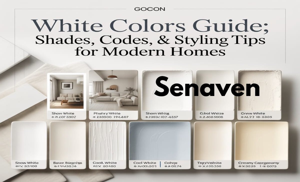
People often search for white colors shades or white colors names to find inspiration. Some of the most widely used shades include ivory, cream, snow white, soft white, pure white, antique white, and off-white.
Ivory and cream belong to the warm family and bring softness to interiors. Snow white and frost white are cooler and give a sharper, cleaner look. Soft white and classic white are balanced shades that work well across different rooms without creating strong color shifts.
Choosing between these shades is less about the name and more about how the color interacts with your room’s lighting and existing materials.
A well-designed white palette is not about using a single shade—it’s about layering different whites and pairing them with complementary tones. This includes choosing the right ceiling shade, as explained in this best ceiling white paint guide, to ensure your space looks balanced from top to bottom.
White Colors Code (HEX & Digital Palette Guide)
For those searching white colors code or white colors hex, here are some commonly used white shades in digital and design projects:
- Pure White: #FFFFFF
- Off White: #F8F8F8
- Ivory: #FFFFF0
- Snow White: #FFFAFA
- Ghost White: #F8F8FF
- Cream: #FFFDD0
These hex codes are especially useful if you’re matching wall colors with digital designs, furniture planning, or mood boards. Keep in mind that paint on walls will never look exactly like a digital color due to lighting and texture differences.
White Colors Palette (How to Combine Whites Effectively)
A well-designed white palette is not about using a single shade—it’s about layering different whites and pairing them with complementary tones.
A balanced white palette often includes a base wall color, slightly contrasting trims, and accent elements. For example, you might use a soft white on walls, a brighter white on trims, and natural wood tones for contrast.
Adding textures like fabric, stone, or wood prevents the space from feeling flat. Without variation, an all-white palette can look unfinished or overly sterile.
White Colors for Walls (How to Choose the Right Paint)
Choosing white colors for walls is one of the most common concerns, and it’s where most mistakes happen. The key is to match the white with your room’s lighting and existing elements.
In north-facing rooms where natural light is cooler, warm whites help balance the space and prevent it from feeling dull. In bright, sunlit rooms, cooler or neutral whites maintain a clean and fresh look without turning yellow.
It’s also important to consider flooring and furniture. A cool white wall next to warm wooden flooring can feel mismatched. Testing paint samples on your walls at different times of the day is the most reliable way to avoid surprises.
A balanced white palette often includes a base wall color, slightly contrasting trims, and accent elements. For example, you might use a soft white on walls, a brighter white on trims, and natural wood tones for contrast. You can also pair white with subtle neutrals like those explained in this gray paint color combinations guide to create depth without overwhelming the space.
Best White Colors Paint (Including Sherwin-Williams Options)
When people search for white colors paint or white colors Sherwin Williams, they’re usually looking for trusted options that work in real homes.
Popular Sherwin-Williams white paints include Alabaster, Pure White, Extra White, and Snowbound. Alabaster is a warm, soft white that works well in living spaces. Pure White is more neutral and versatile, while Extra White leans cooler and is often used for trims and modern designs.
These paints are widely used because they perform consistently across different lighting conditions. However, even with trusted shades, testing samples in your own space is still essential.
White Color Psychology in Interior Design
White is often associated with cleanliness, simplicity, and calmness. It creates a sense of openness and can make even small rooms feel more spacious.
However, the psychological effect of white depends on how it’s used. A room with plain white walls and no variation may feel empty or impersonal, while a well-styled white space feels peaceful and refined. The difference comes from layering textures, adding contrast, and balancing tones.
Practical Styling Tips for White Interiors
- Add texture through fabrics, rugs, and furniture to avoid a flat look
- Use contrast like black accents or darker furniture for depth
- Mix materials such as wood, metal, and plants to create warmth
- Layer slightly different white tones instead of using one flat shade
These small decisions make the difference between a basic white room and a professionally styled space.
Common Mistakes to Avoid When Using White Colors
One of the biggest mistakes is choosing a white paint without testing it in the actual room. Lighting changes everything, and what looks perfect in a store can look completely different at home.
Another common issue is ignoring undertones, which leads to walls that appear yellow, gray, or even slightly green. Using the same white throughout the entire house without considering room-specific lighting can also reduce the overall visual appeal.
Finally, many people forget to add contrast or texture, which makes white spaces feel unfinished rather than elegant.
Pros and Cons of White Colors
Pros:
- Makes spaces feel larger and brighter
- Works with almost any interior style
- Timeless and easy to update
Cons:
- Shows dirt and marks easily
- Can feel cold without proper styling
- Requires careful selection and testing
Expert Advice: How to Choose the Perfect White Color
Professionals don’t treat white as a default—they choose it carefully based on lighting and surroundings. The most important step is testing paint samples on your walls and observing them at different times of the day.
Experts also match undertones with existing elements like flooring and furniture to avoid clashes. Instead of using one flat white, they layer slightly different shades for walls, trims, and ceilings to add depth.
Finally, they balance white with texture and contrast—using materials like wood, fabric, or plants—so the space feels complete rather than empty.
Conclusion
White colors are far more nuanced than they appear. From understanding undertones and shades to choosing the right paint and styling it effectively, every detail matters.
When used correctly, white becomes more than just a color—it becomes a foundation that enhances light, space, and overall design. By testing shades, considering lighting, and layering textures, you can create a home that feels both elegant and comfortable without the common pitfalls of using white.
FAQs
What are the most popular white colors for walls?
Popular choices include soft white, pure white, ivory, and shades like Alabaster or Snowbound because they adapt well to different lighting conditions.
What is the difference between warm white and cool white?
Warm whites have yellow or beige undertones and feel cozy, while cool whites have blue or gray undertones and feel crisp and modern.
Why do white colors look different in every room?
Lighting, wall texture, and surrounding colors all affect how white appears, which is why testing samples is essential.
What are white color hex codes used for?
Hex codes are mainly used in digital design, helping match colors across websites, graphics, and planning tools.
How do I choose the best white paint for my home?
Consider lighting, match undertones with your decor, and always test samples before making a final decision.