What Is Mahogany Color? A Complete Beginner Guide to Meaning, Codes & Home Design Use
If you’ve ever looked at furniture catalogs or home decor inspiration, you’ve likely seen the word mahogany used to describe a color or finish. But for many homeowners and beginners, there’s still confusion: what color is mahogany exactly? Is it red, brown, or something else entirely?
This guide is designed to clear that confusion in the simplest and most practical way. Instead of vague definitions, you’ll learn exactly how mahogany looks, why it appears different in various settings, and how to use it effectively in your home without making costly design mistakes.
Whether you’re choosing furniture, paint, or flooring, understanding mahogany properly can make your space feel more intentional, warm, and visually balanced.
What Is Mahogany Color?
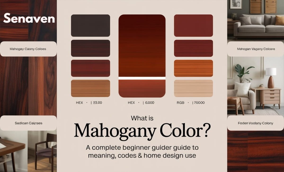
Mahogany is best described as a deep reddish-brown color that combines the richness of dark wood with subtle red undertones. It is inspired by the natural wood of mahogany trees, which has been used for centuries in high-end furniture and interior design.
What makes mahogany unique is that it’s not a flat or single-tone color. Instead, it has depth. At first glance, it may look like a dark brown, but as light hits the surface, you’ll notice a warm red glow underneath. This is what gives mahogany its signature luxurious appearance.
In practical terms, you can think of mahogany as sitting right between brown and burgundy. It’s darker and more grounded than red, but warmer and richer than standard brown.
Why Mahogany Looks Different in Every Home
One of the biggest reasons people get confused about mahogany is because it doesn’t look the same everywhere. You might see a mahogany table that looks almost chocolate brown in one room, while another piece appears reddish or even slightly orange.
This variation happens because of three main factors: lighting, finish, and surrounding colors.
Natural daylight tends to bring out the brown tones, making mahogany appear deeper and more neutral. On the other hand, warm indoor lighting enhances the red undertones, giving it a richer and slightly glowing look.
The finish also plays a huge role. A glossy mahogany surface reflects light and highlights the red hues more strongly, while a matte or satin finish keeps it looking darker and more subdued.
Finally, the colors around it influence how you perceive mahogany. If it’s placed next to cool tones like blue or gray, the warmth becomes more noticeable. But if it’s surrounded by other warm colors, it may blend in and look more brown than red.
Mahogany Color Code (Hex, RGB & Practical Use)
If you’re working on digital designs or trying to match paint, mahogany is often represented using standard color codes. The most commonly used hex code for mahogany is #C04000, which translates to RGB values of (192, 64, 0).
However, in real-world home design, these codes are only a starting point. Paint brands, wood stains, and furniture finishes rarely match one exact code. Instead, they offer variations like “dark mahogany,” “red mahogany,” or “mahogany stain,” each slightly different.
A practical tip from experience: always test a sample before committing. A paint swatch or wood sample in your actual room lighting will give you a far more accurate idea than relying on digital codes alone.
What Does Mahogany Represent? (Color Meaning)
Mahogany isn’t just popular because of how it looks—it also carries a certain feeling and atmosphere. When used in a space, it naturally creates a sense of warmth and depth.
This color is often associated with elegance and tradition. That’s why you’ll commonly see mahogany used in formal dining rooms, home offices, and classic-style interiors. It gives off a sense of stability and maturity, which makes a space feel more grounded and complete.
At the same time, mahogany can also feel cozy and inviting when used correctly. In living rooms or bedrooms, it adds warmth that lighter woods simply can’t achieve. Using mahogany effectively often comes down to thoughtful interior styling techniques that create contrast and visual balance.
How Mahogany Actually Works in Interior Design
Understanding how mahogany behaves in a real space is key to using it successfully. Many homeowners make the mistake of treating it like a regular brown, but it has a stronger visual presence.
Mahogany naturally draws attention because of its depth and undertones. This means it works best when used as a focal element rather than covering every surface in a room.
For example, a mahogany dining table can anchor a space beautifully when paired with lighter walls and soft textures. But if you combine mahogany floors, furniture, and dark walls all together, the room can start to feel heavy and smaller than it actually is.
Balance is everything. Mahogany needs contrast to shine. Lighter colors help open up the space, while cooler tones can modernize its traditional feel.
Another important detail is texture. Pairing mahogany with soft fabrics like linen, cotton, or wool prevents the room from feeling too rigid or formal.
Best Color Combinations With Mahogany
When it comes to pairing colors with mahogany, the goal is to either balance its warmth or complement its richness.
Neutral shades are the safest and most versatile choice. Colors like cream, off-white, and soft beige create a clean contrast that prevents mahogany from overpowering the space. These combinations work especially well in living rooms and bedrooms where you want a calm and inviting atmosphere.
Cool tones such as navy blue, muted teal, or soft gray offer a more modern look. These colors counteract the warmth of mahogany and create a balanced, contemporary feel without clashing.
If you prefer a warmer and more natural look, earthy tones like olive green or terracotta blend beautifully with mahogany. This combination creates a cozy and grounded environment, perfect for relaxed spaces.
Metallic accents also work surprisingly well. Brass or gold elements can enhance the richness of mahogany and add a subtle touch of luxury without making the space feel overdone. If you want a more balanced look, understanding how to balance warm tones in interior design can help you pair mahogany with cooler shades effectively.
Common Mistakes When Using Mahogany (And How to Avoid Them)
One of the most common mistakes is using too much mahogany in one space. While it’s a beautiful color, overusing it can make a room feel dark and heavy. Instead, it’s better to use it strategically—focus on one or two key pieces and let them stand out.
Another issue is poor lighting. Mahogany relies heavily on lighting to show its true character. In a poorly lit room, it can look flat and dull. Adding warm lighting or maximizing natural light can instantly improve how it appears.
Many beginners also forget about contrast. Pairing mahogany with similarly dark colors removes visual depth and makes everything blend together. Introducing lighter elements like rugs, walls, or decor helps create separation and balance.
Finally, ignoring undertones can lead to mismatched designs. Since mahogany has red undertones, it may clash with colors that have strong yellow or pink bases. Testing combinations beforehand can save you from costly mistakes.
Expert Advice and Best Practices
If you want to use mahogany like a professional and not just “make it work,” there are a few practical principles that interior designers consistently follow.
First, always start with lighting before color decisions. Many homeowners pick mahogany furniture or paint without considering how their room is lit. If your space has limited natural light, mahogany can feel darker than expected. In that case, balancing it with lighter walls and layered lighting (ceiling + lamps) makes a noticeable difference.
Another important practice is to treat mahogany as a statement, not a background color. Instead of filling a room with it, let one piece—like a dining table, cabinet, or bed frame—take center stage. This creates a cleaner and more intentional design.
It’s also smart to mix materials to soften the look. Mahogany on its own can feel heavy, especially in modern homes. Pairing it with glass, metal, or soft fabrics breaks that heaviness and makes the space feel more comfortable and current.
Consistency matters too. If you’re using multiple wooden elements, try to keep undertones aligned. Mixing mahogany with very cool-toned woods can feel mismatched. If you must mix, use a neutral “bridge” like a rug or wall color to tie everything together.
Lastly, always test before finalizing. Whether it’s paint, polish, or furniture placement, seeing mahogany in your actual space is the only reliable way to judge how it will look long-term.
Is Mahogany Still Worth It in 2026?
Mahogany has been around for decades, and unlike many design trends, it hasn’t gone out of style. The difference is in how it’s used today.
In the past, mahogany was often associated with heavy, traditional interiors. But in modern homes, it’s being used more selectively. Designers now mix mahogany with lighter palettes, minimal furniture, and clean lines to create a fresh, updated look.
So yes, mahogany is absolutely still worth it in 2026—but only if you use it thoughtfully. Instead of filling an entire room with it, treat it as a statement element that adds warmth and character.
Conclusion
Mahogany is a rich, versatile color that sits between deep brown and red, offering both warmth and sophistication. Once you understand what color mahogany is and how it reacts to lighting and surrounding tones, it becomes much easier to use it effectively in your home.
The key is balance. Let mahogany stand out without overwhelming your space, pair it with complementary colors, and always consider lighting before making final decisions. When used correctly, it can transform an ordinary room into something timeless and inviting.
FAQs
What color is closest to mahogany?
Colors like dark cherry, reddish-brown, and redwood are the closest matches to mahogany.
Is mahogany more red or brown?
Mahogany is primarily brown with noticeable red undertones that become more visible under warm lighting.
Does mahogany work in modern interiors?
Yes, when paired with neutral or cool tones and minimal design elements, mahogany can look very modern.
What wall color goes best with mahogany furniture?
Light neutrals like cream, soft gray, or off-white work best because they balance the depth of mahogany.
Why does mahogany look different in different rooms?
Lighting, finish, and surrounding colors all affect how mahogany appears, making it look more brown or more red depending on the environment.