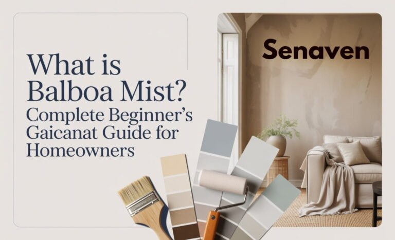
Saybrook Sage (HC-114) by Benjamin Moore: Complete 2026 Guide, Color Palette, Comparisons & Real Use Tips
If you’ve been researching calming green paint colors, chances are you’ve come across Saybrook Sage by Benjamin Moore again and again. It keeps appearing in design blogs, Pinterest boards, and renovation projects—not because it’s trendy, but because it’s reliable, livable, and timeless.
Today’s homeowners aren’t just asking “Is it pretty?” They want to know how it behaves in real lighting, how it compares to other popular greens like October Mist or Clary Sage, and whether it will actually work in their home.
This updated guide answers all of that in one place—based on real-world application, not just color theory.
What Is Saybrook Sage (HC-114) by Benjamin Moore?
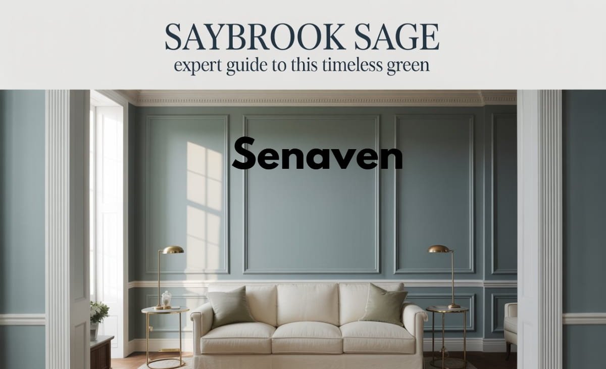
Saybrook Sage (HC-114) is a muted gray-green from the Benjamin Moore Historical Collection, known for its soft, earthy appearance. Unlike bold greens, it behaves more like a neutral, making it easy to live with long-term.
In practical use, it doesn’t shout “green.” Instead, it reads as a subtle, calming backdrop that shifts depending on lighting and surroundings. Its Light Reflectance Value (LRV) sits around 41, placing it firmly in the mid-tone range—dark enough to add depth, but light enough to avoid heaviness.
This balance is exactly why it works in both traditional and modern homes.
How Saybrook Sage Actually Looks in Real Homes
One of the biggest misconceptions is expecting It to look the same everywhere. In reality, it’s highly responsive to lighting.
In north-facing rooms, it leans more gray and can feel cooler or slightly muted. In contrast, south-facing spaces bring out its warmer green undertones, making the room feel softer and more inviting. East- and west-facing rooms show noticeable shifts throughout the day, which adds depth but can surprise homeowners who didn’t test it properly.
From real experience, this color performs best when paired with warm lighting and natural textures. Without that balance, it can look flatter than expected.
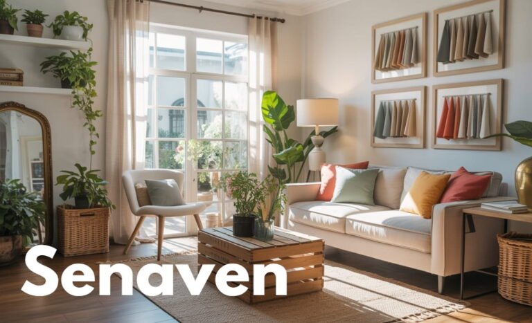
Saybrook Sage Color Palette (What Goes With It)
Creating the right palette is where most people either elevate this color—or completely ruin it. It needs thoughtful pairing to shine.
Best Color Pairings:
- Warm whites and creamy off-whites
- Soft taupes and muted beiges, especially warm neutral paint shades, help balance the green and create a timeless look.
- Natural wood tones (oak, walnut)
- Dusty pinks, terracotta, and muted navy
Materials That Enhance It:
- Linen and cotton fabrics
- Stone surfaces like marble or travertine
- Brass or aged metal finishes
When these elements are combined, Saybrook Sage becomes part of a layered, cohesive design rather than just a wall color.
Saybrook Sage vs October Mist (Key Differences)
A very common comparison is between Saybrook Sage and October Mist (Benjamin Moore’s 2022 Color of the Year).
It is deeper, more grounded, and leans slightly gray. It feels more traditional and stable. October Mist, on the other hand, is lighter, airier, and has a fresher, slightly yellow-green tone that works well in brighter, more modern spaces.
In real homes, Saybrook Sage is the safer choice for long-term use, while October Mist is better if you want something lighter and trend-forward.
Saybrook Sage vs Clary Sage (Sherwin-Williams)
Another popular comparison is with Clary Sage by Sherwin-Williams.
Clary Sage is noticeably lighter and warmer, similar to lighter sage-inspired tones with more visible green. It feels softer and more casual. Saybrook Sage, in contrast, is more muted and refined due to its gray undertones.
If your space gets a lot of natural light, Clary Sage can feel bright and fresh. But in lower-light environments, Saybrook Sage usually performs better because it maintains depth and doesn’t wash out.
Is There a Sherwin-Williams Equivalent to Saybrook Sage?
There isn’t an exact match, but several Sherwin-Williams alternatives come close depending on what aspect you want to replicate.
Clary Sage is the closest in spirit but lighter. Softened Green offers a slightly deeper option, while Evergreen Fog provides a more modern gray-green alternative.
However, in real-world comparisons, Saybrook Sage still sits in a unique middle ground that’s hard to duplicate perfectly.
Where Saybrook Sage Works Best in a Home
Saybrook Sage is versatile, but it performs differently depending on where you use it.
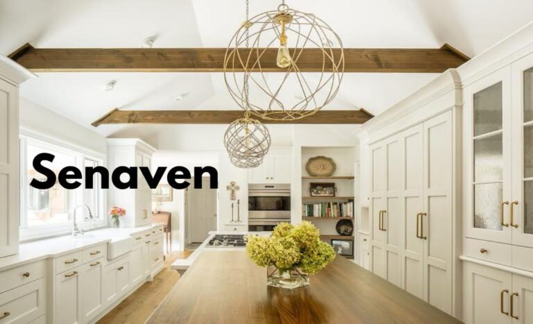
In bedrooms, it creates a calm and restful environment without feeling cold. In living rooms, it acts as a soft backdrop that allows furniture and décor to stand out. Kitchens benefit from its use on cabinetry or islands, especially when paired with white countertops and warm hardware.
Bathrooms are another strong use case, where it creates a spa-like feel without leaning too blue or sterile.
Because it behaves like a neutral, it also works exceptionally well in open floor plans, allowing spaces to flow without visual breaks.
How to Use Saybrook Sage Without Ruining the Look
- Always test large swatches on multiple walls
- Use warm lighting (2700K–3000K bulbs)
- Pair with soft whites instead of stark cool whites
- Add texture through fabrics and natural materials
Common Mistakes Homeowners Make
- Using cool LED lighting that makes the color look flat
- Pairing it with overly cool grays that dull its warmth
- Painting dark rooms without adding contrast or lighting
- Skipping sample testing and relying on online images
These mistakes are the main reason people feel disappointed with this color—not the paint itself.
Paint Finishes That Work Best
- Walls: Eggshell for a soft, clean look
- Kitchens & bathrooms: Satin for durability
- Trim & cabinets: Semi-gloss for contrast
Modern paints have improved, but Saybrook Sage still benefits from a slight sheen to reflect light and avoid looking dull.
Expert Advice (From Real Projects)
From actual interior work, the biggest difference comes from how the color is layered. Homes that look “designer-level” don’t rely on the paint alone—they combine it with wood, textiles, lighting, and contrast.
Another key insight is to evaluate the color at night. Many homeowners only test during the day, then realize the color feels completely different under artificial lighting.
Finally, Saybrook Sage works best when treated as part of a system—not a standalone decision.
Frequently Asked Questions (Updated for 2026)
Is Saybrook Sage still in style?
Yes. Muted, nature-inspired greens are part of long-term biophilic design trends, not short-lived fads.
Does it look more green or gray?
Most of the time, it reads as a balanced gray-green, shifting depending on lighting.
Is Saybrook Sage good for resale?
Yes. It’s considered a safe, neutral-leaning color that appeals to a wide audience.
Can I use Saybrook Sage on cabinets?
Absolutely. It’s one of the best uses, especially with brass or black hardware.
Does it work in small rooms?
Yes, as long as you balance it with lighter elements and proper lighting.
Conclusion: Is Saybrook Sage the Right Choice for You?
Saybrook Sage continues to stand out because it solves a real problem—it gives you color without risk.
It’s calm but not boring, versatile but not bland, and stylish without being trendy. Whether you’re updating a single room or designing an entire home, it offers a level of flexibility that few paint colors can match.
If you want a green that you won’t regret in a year, Saybrook Sage remains one of the smartest choices you can make.