Upward Sherwin Williams: Complete Color Review, Undertones, and Where It Actually Works
If you’ve been searching for upward sherwin williams, chances are you’re stuck between wanting a soft blue and worrying it might turn too gray, too cold, or just “off” in your space. That hesitation is valid—this is one of those colors that can look amazing in one room and completely different in another.
This guide is built to answer exactly what people are searching for: how Upward Sherwin Williams paint actually looks, where it works best (bedroom, kitchen, cabinets, nursery, bathroom), how it behaves in real lighting, and whether it’s the right fit for your home. No guesswork—just practical clarity.
What Color Is Upward Sherwin Williams?
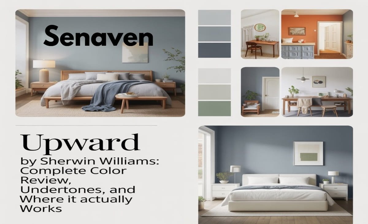
Sherwin-Williams Upward (SW 6239) is a soft, muted blue with a gray base that gives it a calm, airy feel without looking overly pastel. It’s not a bold blue, and it’s not a flat gray either—it sits comfortably in between, which is why so many homeowners consider it when they want a subtle color that still feels fresh.
What makes this color stand out is its flexibility. In some homes, it reads like a gentle sky blue, while in others it behaves more like a blue-tinted neutral. That adaptability is exactly why it shows up in searches for bedrooms, kitchens, cabinets, and even exteriors.
Upward Sherwin Williams Undertones (What You Really See on Walls)
The undertones in Upward are what determine whether you’ll love it or regret it. At its core, this color has a gray undertone that softens the blue and prevents it from feeling childish or overly bright. That gray influence is what allows it to pair so easily with modern interiors.
At the same time, the blue is still clearly visible—especially in natural daylight. In brighter conditions, you’ll notice a light, airy blue. In lower light or warmer lighting, the gray becomes more dominant, sometimes making the color feel more muted than expected.
This dual behavior is why many people search things like “does upward sherwin williams look blue or gray?”—and the honest answer is: it depends heavily on your lighting.
At the same time, many homeowners also look into gray undertone paint colors for modern homes when they want something more contemporary and balanced. These shades sit between cool and neutral, making them ideal for clean, modern interiors where subtle depth and softness are both important.
How Lighting Changes Upward Sherwin Williams
Lighting is the biggest factor with this color, and it’s where most mistakes happen if you skip testing.
In rooms with strong natural sunlight, Upward opens up into a soft, clean blue that feels fresh and calming. In spaces with indirect or limited light, it becomes more subdued and can lean toward a blue-gray appearance.
Artificial lighting also plays a role. Warm bulbs tend to mute the blue and highlight the gray undertone, while cooler lighting brings out more of the crisp blue tone. Because of this, the same paint can look noticeably different between day and night.
This is why testing on multiple walls—and observing it throughout the day—is not optional with this shade.
Is Upward Sherwin Williams Warm or Cool?
Upward is a cool-toned color, but it’s not sharply cold. The gray undertone softens the coolness just enough to make it livable in most homes.
In practical terms, this means it pairs naturally with cooler finishes like white trim, marble, or brushed nickel. At the same time, it can balance warmer elements like wood flooring or beige furniture by adding contrast without clashing.
If your home already leans cool, this color will blend seamlessly. If your space is very warm-toned, it can still work—but you’ll want to balance it carefully with textures and decor.
Best Rooms to Use Upward Sherwin Williams
Upward Sherwin Williams Bedroom
This is where the color performs best. In a bedroom, Upward creates a calm and restful environment without feeling dull. It’s soft enough to relax your eyes but still adds personality compared to plain white or gray walls. Many homeowners choose it specifically because it doesn’t feel overly “baby blue,” making it suitable for both adults and guest rooms.
Upward Sherwin Williams Nursery
For nurseries, Upward is a popular choice because it feels gentle and soothing without being overly themed. It works well for gender-neutral designs and pairs beautifully with whites, soft woods, and minimal decor. The gray undertone keeps it from looking too playful, which helps the room grow with the child.
Upward Sherwin Williams Bathroom
In bathrooms, this color gives a clean, spa-like feel. It reflects light nicely, making smaller bathrooms feel more open. When paired with white tiles and simple fixtures, it creates a fresh and uncluttered look that feels intentional rather than plain.
If you’re exploring soft neutral paint colors like Accessible Beige, it usually means you’re trying to find a shade that feels warm, timeless, and flexible enough to work in different lighting conditions. These kinds of neutrals are popular because they create a calm base without making a space feel too cold or sterile.
Upward Sherwin Williams Kitchen
Using Upward on kitchen walls can brighten the space without overpowering it. It works especially well in kitchens that already have plenty of natural light. Instead of feeling stark like white, it introduces a soft layer of color that still keeps the space feeling open and inviting.
Upward Sherwin Williams Cabinets & Kitchen Cabinets
This is one of the most searched uses—and for good reason. Upward works beautifully on cabinets, particularly when used on lower cabinets or a kitchen island. It adds subtle color while maintaining a clean, modern look.
For full kitchen cabinets, it works best when balanced with white countertops or backsplashes. Because it’s not a deep color, it won’t dominate the kitchen—but it will add enough contrast to make the design feel more custom.
Upward Sherwin Williams Exterior Use
Using Upward on exteriors requires a bit more caution. In outdoor lighting, colors tend to appear brighter and more saturated. That means Upward can look more blue than expected in direct sunlight.
It works best as an accent color on doors, shutters, or smaller exterior sections rather than full siding. On coastal or light-toned homes, it can look especially fresh and inviting. However, testing outside is even more important than indoors due to changing daylight conditions.
Best Coordinating Colors for Upward Sherwin Williams
Choosing the right supporting colors will determine how polished the final result feels.
- Crisp whites create a clean, modern contrast and highlight the blue tones
- Soft greiges and light grays help maintain a subtle, cohesive palette
- Natural wood tones add warmth and prevent the space from feeling too cool
- Deeper blues or navy accents can add depth without clashing
The key is balance—since Upward is already soft, pairing it with overly muted colors can make the space feel flat.
Pros and Cons of Upward Sherwin Williams
Pros
- Soft and calming without feeling boring
- Versatile across multiple rooms (bedroom, kitchen, bathroom, nursery)
- Works as a subtle alternative to gray
- Easy to coordinate with modern interiors
Cons
- Can look too cool in low-light rooms
- Shifts between blue and gray depending on lighting
- Not ideal if you want a bold or high-contrast color
Expert Advice for Using Upward Sherwin Williams
With Upward Sherwin Williams paint, the biggest key is understanding how much lighting affects it. Always test it on multiple walls before finalizing, because it can shift between soft blue and muted gray depending on the room.
Treat it more like a soft neutral than a bold color. In bedrooms and nurseries, keep the palette light with whites and natural wood to maintain its calm feel. In kitchens and cabinets, pairing it with crisp white countertops or backsplashes helps balance the cool tone.
Also pay attention to lighting—warm bulbs will soften the blue, while neutral lighting keeps it looking fresh and clean.
Conclusion
Upward Sherwin Williams is one of those colors that quietly does everything right. It adds personality without overwhelming a space, works across multiple rooms, and adapts well to different styles.
However, it’s not a “paint and forget” color. Its undertones and lighting sensitivity mean you need to test it properly before committing. If you do that, you’ll likely end up with a soft, timeless blue that feels both modern and comfortable.
For homeowners looking for a safe but stylish move away from plain neutrals, Upward is a strong contender.
FAQs
What color is Upward Sherwin Williams?
It’s a light blue paint with gray undertones, giving it a soft and muted appearance rather than a bright pastel look.
Is Upward Sherwin Williams good for kitchen cabinets?
Yes, especially for lower cabinets or islands. It adds subtle color while keeping the kitchen light and modern.
Does Upward Sherwin Williams work in bathrooms?
It works very well in bathrooms, creating a fresh, clean, and spa-like atmosphere.
Is Upward Sherwin Williams suitable for a nursery?
Yes, it’s a great gender-neutral option with a calming feel that isn’t overly playful.
Can Upward Sherwin Williams be used on exteriors?
Yes, but it’s best for accents like doors or shutters since it can appear brighter outdoors.