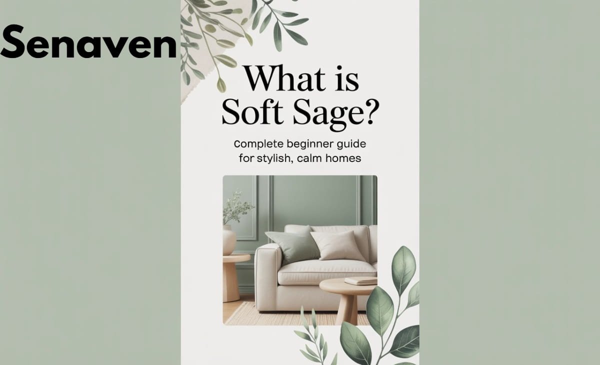
What Is Soft Sage? Complete Beginner Guide for Stylish, Calm Homes
Soft sage has moved beyond being just a “trendy green” — in 2026, it’s widely considered a modern neutral. People searching for soft sage, soft sage green color, soft sage paint, or Sherwin-Williams sage shades are usually trying to answer one core question:
“How do I choose and use the right soft sage shade in my home without making mistakes?”
This updated guide is built to answer that completely—covering color codes, real paint options, undertones, lighting behavior, and practical usage based on real-world experience.
What Is Soft Sage Color?
It is a muted, gray-green color inspired by the natural sage plant. What makes it different from standard green shades is its desaturation—it’s toned down with gray, which removes brightness and adds sophistication.
In practical terms, It behaves like a neutral. It doesn’t dominate a room but quietly enhances it. Depending on lighting and surrounding colors, it can appear slightly warm (earthy green) or slightly cool (gray-green), which is why many homeowners get confused when the same paint looks different in two rooms.
Soft Sage Green Color Code (HEX, RGB & Paint Matching)
If you’re searching for the exact soft sage green color code, here’s a reliable reference range used in design:
- HEX: #B2AC88 (common soft sage base tone)
- RGB: (178, 172, 136)
- HSL: (51°, 19%, 62%)
However, it’s important to understand that “soft sage” is not a single fixed color. Paint brands create multiple variations with subtle undertone differences. That’s why relying only on a HEX code for walls can lead to mismatched results in real spaces.
Best Soft Sage Paint Colors (Including Sherwin-Williams)
If you’re specifically looking for soft sage green paint or Sherwin-Williams options, these are widely used and reliable shades:
- Sherwin-Williams Clary Sage (SW 6178) – slightly warmer and earthy
- Sherwin-Williams Sea Salt (SW 6204) – lighter, airier sage with blue undertones
- Sherwin-Williams Softened Green (SW 6177) – muted and balanced sage tone
These paints are popular because they adapt well to different lighting conditions and don’t turn overly green or muddy—something cheaper or poorly chosen shades often do.
A practical tip from real projects: Sea Salt works better in smaller or darker rooms, while Clary Sage performs best in well-lit spaces where its warmth can show properly.
Why Soft Sage Green Is So Popular in 2026
It aligns perfectly with current design priorities. Modern homes are moving toward calming environments, and this color supports that without feeling boring. It connects indoor spaces with nature, which is why it’s heavily used in biophilic design.
Another reason for its popularity is flexibility. Unlike bold colors that require full commitment, It allows gradual styling. You can start with paint, then layer furniture and textures over time without clashing.
How Soft Sage Actually Looks in Different Lighting
One of the biggest reasons people search for “soft sage paint color” is confusion after applying it. The truth is, lighting changes everything.
In north-facing rooms, It tends to look cooler and slightly gray. In south-facing spaces, it appears warmer and more green. Artificial lighting also plays a role—cool white LEDs can make it feel dull, while warm lighting enhances its softness.
This is why testing paint on multiple walls and checking it at different times of the day is not optional—it’s essential.
How to Use Soft Sage in Your Home (Real Practical Guidance)
It works best when treated as a foundation rather than a feature. In living rooms, it creates a calm backdrop that allows furniture and textures to stand out. Pairing it with beige sofas, wooden tables, and subtle metallic accents results in a balanced, high-end look without relying on bold colors.
In bedrooms, it naturally supports relaxation. When combined with soft white bedding, warm wood tones, and layered lighting, it creates a space that feels restful without being plain.
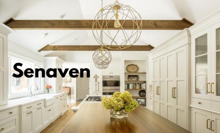
Kitchens are one of the most popular places to use soft sage today. Cabinets in this shade offer a fresh alternative to white while still feeling timeless. When paired with marble or quartz countertops and matte hardware, the result feels both modern and classic.
Bathrooms benefit from its spa-like effect. It walls or tiles combined with natural stone and simple white elements create a clean, calming environment.
Even in overlooked spaces like hallways or entryways, it adds continuity and makes the entire home feel thoughtfully designed, introducing mahogany wood tone for contrast and richness.
Common Mistakes People Make With Soft Sage
Many homeowners assume all sage greens are the same, which leads to poor results. Undertones vary significantly, and choosing the wrong one can make the space feel too gray, too green, or even slightly muddy.
Another common issue is overusing the color. Covering every wall and surface in sage can create a heavy, themed look instead of a balanced interior. It works best when supported by neutrals.
Lighting mistakes are equally common. Without proper lighting, the color can lose its depth and appear flat. This is especially noticeable in kitchens and bathrooms.
Finally, using the wrong paint finish can affect the overall feel. Matte or eggshell finishes maintain softness, while overly glossy finishes can make the color look outdated.
Practical Tips From Real Experience
Testing paint samples on multiple walls is the single most important step. Many people skip this and regret it after painting the entire room balanced, high-end look without relying on bold colors like timeless beige.
It also helps to build the room in layers. Instead of relying only on color, combine materials like wood, linen, stone, and soft fabrics. This adds depth without introducing unnecessary colors.
Another useful approach is starting small. Try soft sage in decor items like cushions or curtains before committing to walls or cabinets. This reduces risk and helps you understand how the color behaves in your space.
Best Color Pairings for Soft Sage
It works best with neutrals and earthy tones because they enhance its natural feel without overpowering it.
Best combinations
- Warm white, cream, and beige create a soft, cohesive look
- Natural wood tones (oak, walnut) add warmth and depth
- Taupe and light brown tones maintain an earthy palette
For contrast
- Navy blue adds richness without clashing
- Charcoal gray provides a modern edge
- Terracotta introduces warmth and character
Alternatives to Soft Sage (If It Doesn’t Work for You)
If soft sage feels too muted, muted olive offers a warmer, deeper option. If you want something fresher and brighter, pale mint can work better in smaller or casual spaces. For a slightly cooler and more modern look, dusty eucalyptus tones are a strong alternative.
Expert Advice & Best Practices
From hands-on interior work, one thing stands out: It is most successful when used intentionally, not excessively. It should support the space, not dominate it.
Always test colors in real conditions, pay attention to undertones, and prioritize lighting as much as paint choice. Combining soft sage with natural materials consistently delivers better results than trying to pair it with too many contrasting colors.
Maintaining consistency across rooms—through repeated accents or finishes—also helps create a cohesive home rather than disconnected spaces.
FAQs About Soft Sage Green
Is soft sage green still in style?
Yes, it has become a long-term neutral rather than a short-term trend.
What is the best soft sage paint color?
Sherwin-Williams Sea Salt and Clary Sage are among the most reliable options depending on lighting.
What is the exact soft sage green color code?
A common reference is HEX #B2AC88, but real paint shades vary slightly.
Does soft sage work in small rooms?
Yes, especially when paired with good lighting—it can make spaces feel open and calm.
Is It warm or cool?
It can be both, depending on undertones and lighting conditions.
Can I use soft sage with wood furniture?
Yes, it pairs exceptionally well with both light and dark wood tones.
Conclusion
It is one of the few colors that successfully balances style, flexibility, and comfort. It adapts to different spaces, supports modern design trends, and remains timeless enough to last for years.
If you approach it correctly—by testing shades, understanding lighting, and layering textures—you won’t just follow a trend. You’ll create a space that feels calm, intentional, and professionally designed.