Opposite of Purple: 5 Easy Ways to Balance It in Real Home Spaces
When people search for the opposite of purple, they are usually trying to figure out practical applications in interior design, color matching, or even everyday décor. They don’t just want a color theory lecture—they want real solutions for walls, furniture, and accessories that make their space look balanced and feel comfortable.
Purple is a bold, emotional color. It can make a room feel luxurious, cozy, or dramatic—but it can also feel overwhelming if used without care. Knowing its opposite and how to use it correctly ensures harmony, contrast, and visual comfort in your home. This guide also addresses related searches, such as opposite of purple on color wheel, opposite of purple and blue, opposite of purple and yellow, opposite of purple and green, and even the meaning of opposite of purple patch in practical contexts.
Understanding the Opposite of Purple (Color Wheel Basics)
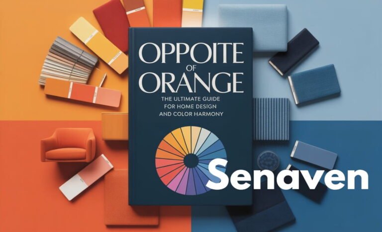
In traditional color theory, the opposite of a color is called its complementary color. This is the color directly across from it on the color wheel. Complementary colors create the strongest visual contrast and naturally balance each other.
Purple is made by mixing red and blue, and on the standard color wheel, yellow sits directly opposite purple, making yellow its true complementary color.
However, there’s nuance. Not all purples are the same—some lean more blue, others more red. Blue-based purples pair better with warm golden yellows, while red-based purples look best with muted, earthy yellows. Understanding this helps avoid harsh clashes and creates a natural, harmonious balance.
Opposite of purple and blue: Blue itself is next to purple on the color wheel, so it’s not the opposite—it creates a tonal harmony instead. Using blue with purple softens the intensity and is perfect for monochromatic or layered designs.
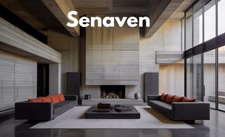
Opposite of purple and green: Green is neither directly opposite nor complementary to purple. Instead, green adds natural harmony, working best as an accent rather than a contrast. Think houseplants, green textiles, or soft green walls near purple furniture—they calm the room rather than create sharp contrast.
Applying Opposite of Purple in Real Home Spaces
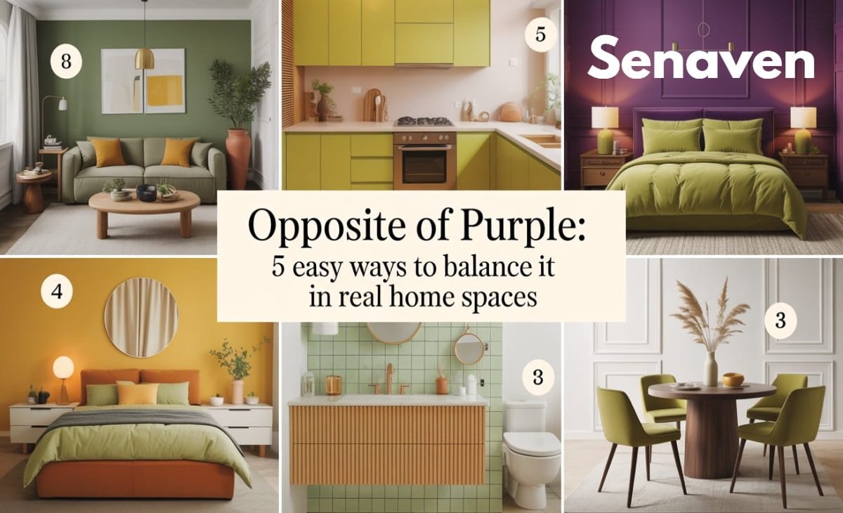
Using the opposite of purple doesn’t always mean painting everything bright yellow. In practical interior design, soft, muted, and warm yellow-based tones work better. Cream, beige, soft gold, and light ochre all fall into this category, balancing purple gently without overwhelming your senses.
Lighting plays a critical role as well. Cool white lights make purple appear harsher, while warm lighting (2700K–3000K) enhances yellow undertones and softens contrasts naturally. Before repainting a wall, test your purple and yellow pairings under both daylight and evening lighting to ensure a balanced result.
Materials are another overlooked tool. Introducing yellow-based tones through wood finishes, brass décor, cushions, or neutral textiles often works better than bold paint. This approach keeps the design timeless, flexible, and easier to update in the future.
For bedrooms, nurseries, or calm areas, consider using softer alternatives like cream, warm beige, taupe, or warm gray with yellow undertones. These shades support purple without creating visual tension. Strong purple-yellow contrast may be stimulating, which is great for energetic areas but less suitable for relaxation spaces.
New Insights Competitors Miss
- Undertone Matching: It’s not just about purple vs. yellow—the undertone of your purple (blue vs. red) determines the best complementary yellow.
- Texture Matters: Velvet, matte, or textured walls diffuse the intensity of purple and reduce reliance on high-contrast yellow.
- 60-30-10 Balance Rule: Use 60% dominant color, 30% secondary color, and 10% accent color for harmony. For example, 60% cream walls, 30% purple sofa, 10% gold/brass accents.
Practical Tips for Balancing Purple
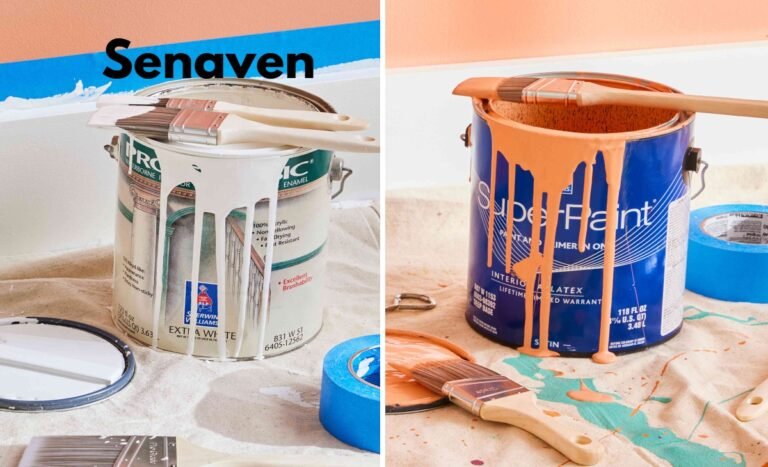
- Always test colors first: Small paint samples can prevent costly mistakes.
- Adjust lighting before painting: Warm bulbs can transform a purple room without repainting.
- Use materials to introduce complementary colors: Wood, fabrics, and metallics can balance purple subtly.
- Layer colors carefully: Avoid overuse of both purple and yellow—let neutrals support the space.
Common Mistakes to Avoid
Many homeowners misapply the “opposite color” concept:
- Pairing deep purple with bright, pure yellow without considering undertones.
- Testing colors only in daylight.
- Relying solely on paint rather than textures or materials.
- Ignoring the emotional effect: high-contrast purple-yellow can overstimulate spaces meant for relaxation.
Answering Trending Searches
- Opposite of purple on color wheel: Yellow is opposite. Use soft yellow tones for interiors.
- Opposite of purple color: Same answer—yellow, but select muted shades for balance.
- Opposite of purple and blue: Blue is a near neighbor of purple, creating harmony, not contrast.
- Opposite of purple and yellow: Yellow is purple’s complement; use warm tones for best results.
- Opposite of purple and green: Green harmonizes rather than contrasts; ideal for accents or plants.
- Opposite of purple patch: In everyday language, “purple patch” refers to a period of success. Its opposite is a “slump” or challenging period—this is unrelated to color but may appear in searches.
FAQs (Updated)
Is yellow always the opposite of purple?
Yes, but in interiors, soft yellow-based tones are recommended over pure bright yellow.
Can blue work as an opposite to purple?
No. Blue harmonizes with purple rather than creating contrast.
What is the safest way to balance a purple-heavy room?
Introduce soft yellow-based tones through materials, lighting, and textiles before repainting walls.
Does green neutralize purple?
Not exactly. Green calms a purple-heavy space rather than neutralizing it.
What is the opposite of lavender?
Lavender is light purple; its opposite is pale yellow or cream.
Conclusion
The opposite of purple is yellow, but successful application is what makes the difference. Real-world interior design requires considering undertones, lighting, materials, textures, and the purpose of the room. By thoughtfully applying these principles, you can balance purple effectively, avoid common mistakes, and create spaces that are elegant, calming, and visually appealing.