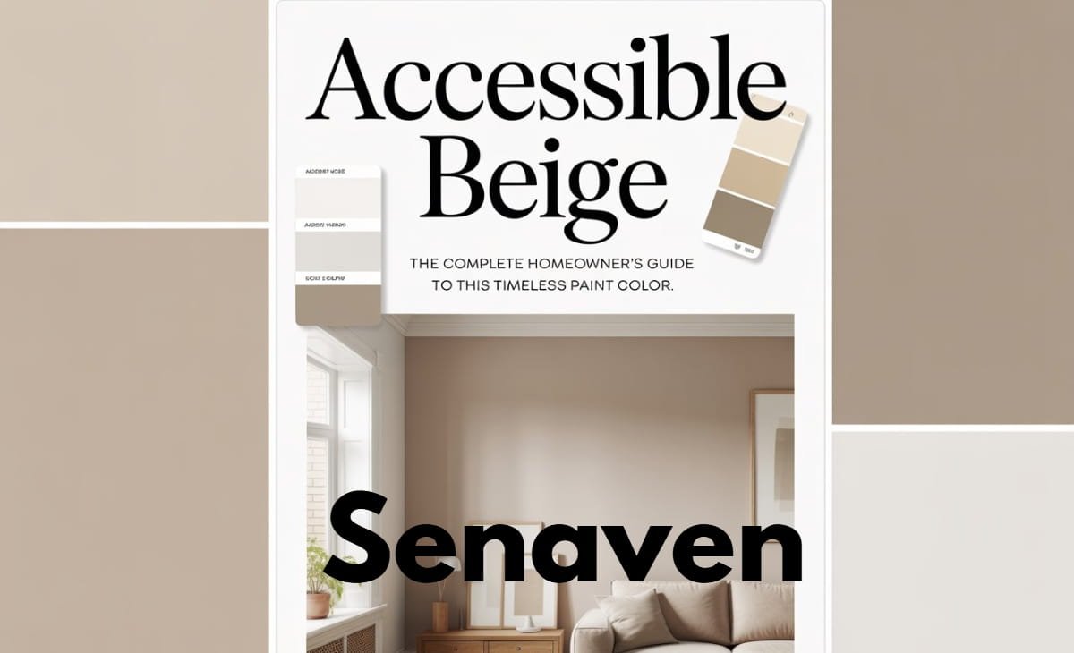
Accessible Beige (SW 7036): The Complete 2026 Guide to This Versatile Neutral Paint Color
Choosing the right neutral paint color today isn’t just about playing it safe—it’s about finding a shade that works across lighting conditions, complements your décor, and still feels modern years later. That’s exactly why Accessible Beige by Sherwin-Williams continues to be one of the most trusted and searched paint colors, especially when paired with clean whites like a crisp ceiling and trim shade.
Unlike traditional beiges that can feel yellow or outdated, Accessible Beige offers a balanced, modern look. It adapts beautifully to different spaces, making it ideal for homeowners who want a cohesive design without constantly repainting.
In this updated guide, you’ll learn how to use Accessible Beige effectively, avoid common mistakes, and create a space that looks professionally designed.
What Is Accessible Beige (Sherwin-Williams SW 7036)?
Accessible Beige (SW 7036) is a warm neutral paint color with subtle gray undertones. It falls into the “greige” category, meaning it blends the softness of beige with the modern edge of gray.
This balance is what makes it so popular. It doesn’t feel too cool like many gray paints, and it avoids the overly warm, yellow tones of traditional beige. As a result, it works well in a wide range of interior styles—from modern and minimalist to classic and transitional.
Because of its versatility, Accessible Beige is commonly used on walls, cabinetry, and even exterior surfaces.
Undertones and Lighting: Why This Color Changes Throughout the Day
One of the most important things to understand about Accessible Beige is how it reacts to lighting. This is where many homeowners make costly mistakes.
In rooms with limited natural light, it can appear slightly cooler and more muted. In brighter spaces, especially those with southern exposure, it becomes warmer and more inviting. East- and west-facing rooms will see subtle shifts throughout the day as sunlight changes.
Artificial lighting also plays a major role. Warm bulbs enhance its beige tones, while cooler lighting brings out its gray side. This is why testing the color directly on your walls is essential before committing.
Where Accessible Beige Works Best in Your Home
Accessible Beige is known for its ability to create a smooth, cohesive look throughout a home.
In living rooms, it provides a warm and welcoming backdrop that works well with layered textures like rugs, throws, and curtains. In bedrooms, it helps create a calm and relaxing atmosphere without feeling too dark or heavy.
Kitchens are another popular space for this color, especially when paired with white countertops, natural wood, or warm metallic finishes. In hallways and open-concept areas, it helps connect different rooms without creating harsh transitions, making the entire home feel more unified.
Accessible Beige Color Palette (Best Pairings)
This is one of the most searched aspects of this paint color—and for good reason. The right palette makes all the difference.
Best Color Pairings
- Soft warm whites, such as a versatile off-white for trim, work beautifully for ceilings and woodwork.
- Muted greens like sage or olive
- Dusty blues for subtle contrast
- Charcoal gray for depth
- Blush tones for added warmth
Best Material Pairings
- Natural wood such as oak or walnut
- Linen and cotton fabrics
- Rattan and woven textures
- Brushed brass or matte black finishes
Accessible Beige performs best when paired with contrast and texture. Without these elements, the space can feel flat or overly neutral.
Accessible Beige vs Benjamin Moore (Closest Matches Explained)
Many homeowners search for a Benjamin Moore equivalent to Accessible Beige, but there is no exact match. However, a few options come close.
Revere Pewter by Benjamin Moore is darker and has more depth, making it better suited for larger spaces. Edgecomb Gray is lighter and airier but lacks the same level of warmth.
Accessible Beige sits comfortably between these options, offering a balanced look that works in most settings without feeling too heavy or too light.
Benefits and Drawbacks (From Real-World Use)
Accessible Beige is widely appreciated for its versatility and ability to adapt to different styles. It also does a good job of hiding minor wall imperfections, which makes it practical for everyday living.
However, it’s not perfect. In rooms with poor lighting, it can appear slightly dull or muddy. It can also feel monotonous if everything in the room matches too closely. To avoid this, it’s important to introduce contrast and variation in textures.
Painting Accessible Beige (Tools and Process)
Tools You’ll Need
- High-quality roller (3/8-inch nap recommended)
- Angled brush for edges
- Painter’s tape
- Primer for dark or uneven walls
Basic Application Process
Start by properly cleaning and preparing your walls, as surface dust or residue can affect the final finish. If you’re covering a darker color or uneven patches, applying primer is essential.
Cut in the edges first using a brush, then use a roller to apply even coats across larger areas. Two coats are typically needed for full, consistent coverage. Allow proper drying time between coats to achieve a smooth, professional result.
Common Mistakes to Avoid
One of the biggest mistakes is not testing the paint in your actual space. Lighting conditions vary greatly, and what looks perfect in-store may look completely different at home.
Another common issue is overusing similar beige tones throughout the room, which removes contrast and makes the space feel flat. Ignoring flooring undertones can also lead to clashes, especially with pink or red-toned floors.
Using the wrong paint finish—such as flat paint in high-moisture areas—can reduce durability and lead to maintenance problems later.
Expert-Level Practical Tips
From real-world experience, Accessible Beige works best when treated as a foundation rather than the main feature. The key is layering.
Introduce contrast through darker furniture, textured fabrics, or statement décor pieces. Mixing warm and cool elements—such as wood with metal—creates balance and keeps the space visually interesting.
If you’re unsure, start by painting a single wall or a smaller area. This allows you to see how the color behaves in your environment before committing to a full room.
FAQs
Is Accessible Beige a Sherwin-Williams color?
Yes, it is an official Sherwin-Williams paint color with the code SW 7036.
What type of paint color is Accessible Beige?
It is a warm greige, combining beige and gray undertones.
Does Accessible Beige look more gray or beige?
It depends on lighting. In brighter spaces, it leans warmer; in lower light, it can appear more gray.
What trim color works best with Accessible Beige?
A soft white or slightly warm white creates the best contrast.
Can Accessible Beige be used for exteriors?
Yes, but it may appear flatter outdoors, so adding contrast with trim or accents is recommended.
Conclusion
Accessible Beige remains one of the most reliable neutral paint colors because of its balance, flexibility, and timeless appeal. It adapts to different lighting conditions, works with a wide range of materials, and helps create a cohesive look throughout your home.
However, its success depends on how you use it. By paying attention to lighting, adding contrast, and layering textures, you can turn a simple neutral into a well-designed, high-impact space.