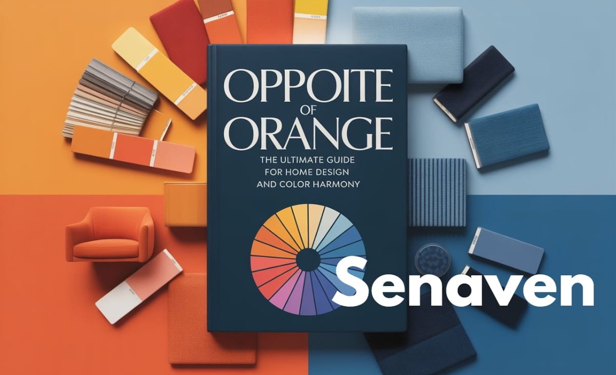
Opposite of Orange: The Ultimate Guide for Home Design and Color Harmony
When people search “opposite of orange”, they’re usually looking for a quick, clear answer—but often end up confused by different explanations (color theory, design use, or even unrelated meanings like fruit or language).
Let’s clear everything up in a simple, accurate, and practical way.
The opposite of orange is blue.
This comes from the Color Theory and specifically the traditional color wheel used in art and interior design.
But that’s just the starting point. In this complete guide, you’ll learn how this works on the color wheel, how it applies in real homes, and answers to all related questions people commonly search on Google.
Opposite of Orange on the Color Wheel
On a standard color wheel, colors are arranged in a circular format to show relationships. Colors that sit directly across from each other are called complementary colors, and they create the strongest contrast.
Orange sits directly opposite blue, which is why blue is its true opposite.
This contrast works because orange is a warm color (associated with energy and warmth), while blue is a cool color (associated with calmness and relaxation). When used together, they balance each other visually and emotionally.
Opposite of Orange Colour (Simple Explanation)
If you’re asking in the most basic sense—“what is opposite of orange colour?”—the answer remains blue.
However, the exact shade of blue depends on the type of orange:
- Bright orange pairs best with vivid blues
- Burnt orange works with navy or deep teal
- Peach or light orange pairs with sky blue
This is where many articles fall short—they give one answer but ignore real-life application.
Opposite of Orange and Blue (Common Confusion Explained)
Many users search “opposite of orange and blue”, which creates confusion.
Here’s the correct breakdown:
- Opposite of orange → blue
- Opposite of blue → orange
They are complementary pairs, meaning they are opposites of each other.
This is why you often see them used together in:
- Interior design
- Sports branding
- Movie posters
They naturally create strong contrast and visual interest.
Opposite of Orange and Yellow
This is another commonly searched query, and the answer depends on which color you’re focusing on.
- Opposite of orange → blue
- Opposite of yellow → purple
Orange and yellow sit next to each other on the color wheel (they are analogous colors), so they share similar warm tones. Their opposites are different:
- Orange balances with blue
- Yellow balances with purple
Understanding this helps avoid mixing the wrong complementary colors in design.
Opposite of Orange Fruit (Clarifying Intent)
If someone asks “opposite of orange fruit”, this is not a color theory question.
There is no true “opposite” of a fruit. However, depending on context:
- In taste: citrus (orange) vs something bitter or savory
- In color: the fruit is orange → opposite color is blue
- In categories: fruit vs vegetables
So, the correct answer depends entirely on what the user means—but scientifically, fruits don’t have opposites.
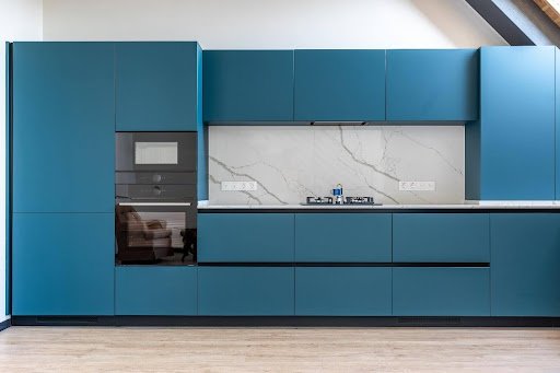
How to Use the Opposite of Orange in Home Design
In real homes, using the opposite of orange isn’t about theory—it’s about balance. From practical experience, the biggest mistake homeowners make is going too bold too fast.
A better approach is to start with your existing orange elements—like a sofa, wall, or décor—and introduce blue gradually through accents such as cushions, rugs, or artwork. This allows you to test the contrast without committing to a full redesign.
Modern interior trends (especially in 2025–2026) have shifted toward muted combinations, such as burnt orange with dusty blue or terracotta with gray-blue. These combinations feel more premium and less overwhelming compared to bright, saturated tones.
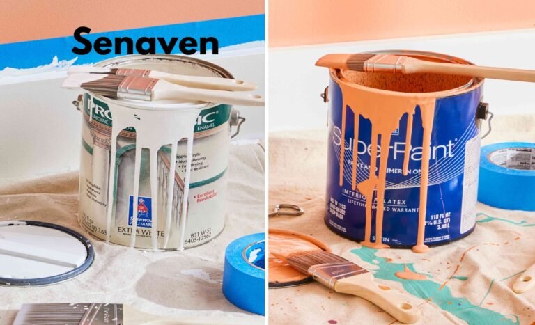
Lighting also plays a critical role. Warm indoor lighting can dull blue shades, while natural daylight can intensify contrast. Always test colors in your actual room before final decisions.
Real-World Design Insight (What Actually Works)
In practical home projects, one consistent pattern appears: strong contrast works best when one color dominates and the other supports it.
For example, a living room with a navy base (walls or large furniture) and small orange accents feels calm and modern. But reversing that—large orange walls with bright blue accents—can feel overwhelming unless carefully balanced with neutrals.
Another overlooked factor is texture. Flat colors can feel harsh, but when you add wood, fabric, or natural materials, the same orange-blue combination becomes warm and inviting.
Another overlooked factor is texture. Flat colors can feel harsh, but when you add wood, fabric, or natural materials, the same orange-blue combination becomes warm and inviting. For a nature-inspired alternative, consider muted green tones to balance vibrant accents beautifully and create a calm, stylish space.
Common Mistakes to Avoid (Expert Perspective)
1. Overusing Bright Shades
Too much saturated orange and blue creates visual stress instead of harmony.
2. Ignoring Undertones
Not all oranges or blues match—undertones must align.
3. Skipping Real-Life Testing
Colors look different on walls than on screens or samples.
4. No Neutral Balance
Without whites, grays, or wood tones, the space feels chaotic.
Expert Advice for Best Results
Keep Contrast Controlled
Use bold color combinations in limited areas instead of the entire room.
Follow the 60-30-10 Rule
This ensures balance between dominant, secondary, and accent colors.
In practical home projects, one consistent pattern appears: strong contrast works best when one color dominates and the other supports it. To soften bold orange-blue contrasts and maintain a cohesive look, add neutral beige tones as complementary accents throughout your space.
FAQs
What is the opposite of orange?
Blue.
What is the opposite of orange on the color wheel?
Blue, because it sits directly across from orange.
What is the opposite of orange colour in design?
Blue, but the exact shade depends on the orange used.
What is the opposite of orange and blue?
They are opposites of each other.
What is the opposite of orange and yellow?
Orange → blue, Yellow → purple.
Is there an opposite of orange fruit?
No, fruits don’t have true opposites—this depends on context.
Conclusion (Clear & Intent-Focused)
The opposite of orange is blue, both in theory and in real-world application. But understanding how to use this relationship is what truly matters.
Whether you’re choosing paint, styling a room, or just trying to understand color basics, the key is balance. Match the right shades, test them in real lighting, and avoid overusing bold contrasts.
Once applied correctly, the orange and blue combination becomes one of the most powerful and timeless tools in design—helping you create spaces that feel both energetic and calm at the same time.